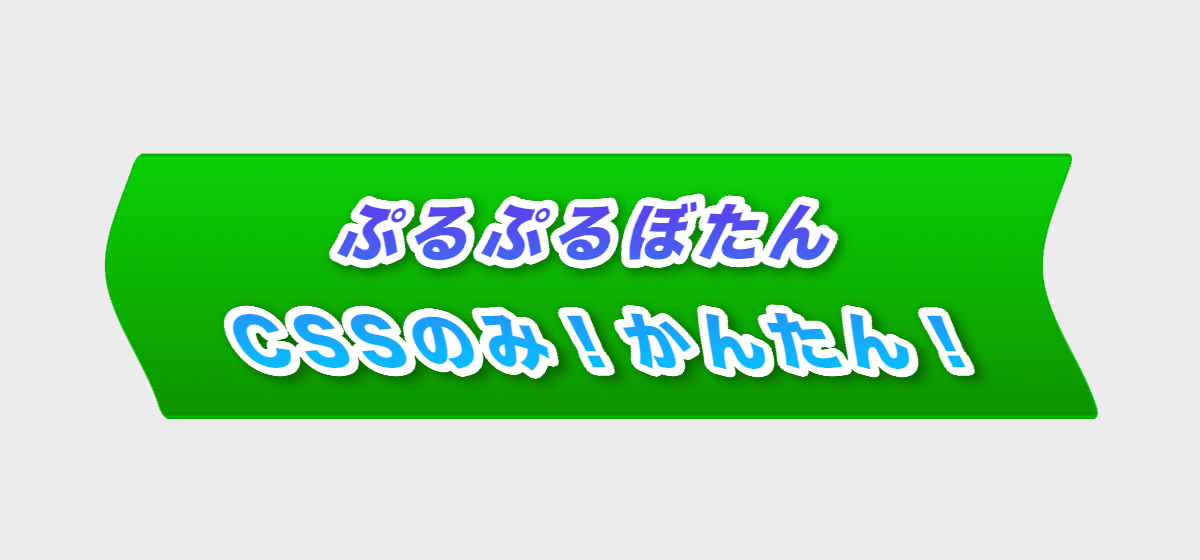
このような「ぷるぷる動くボタンの作り方」を紹介します。
このぷるぷるボタンのHTMLとCSSのコードはこちらです。
HTML
<button class="purupuru01">カーソルのせて!それから長押ししてみて!</button>
CSS
.purupuru01:hover{
  color: #fff;
  box-shadow: 0px 6px 0px 0px #24581d;
  bottom: 6px;
}
.purupuru01:active{
  box-shadow: 0px 0px 0px 0px #24581d;
  bottom: 0px;
}
.purupuru01:focus{
  outline:none;
}
.purupuru01{
  animation-name: purupuru;
  animation-duration: 4s;
  animation-timing-function: ease;
  animation-iteration-count: infinite;
  animation-play-state: running;
  animation-direction: normal;
  animation-delay: 2s;
  border: solid 1px #0bb404;
  padding: 1em 2em;
  border-radius: 3px;
  background: linear-gradient(0deg, #0e9400, #08d005);
  color: #fff;
  position: relative;
  bottom: 0;
  transition: all 100ms;
}
@keyframes purupuru {
  1.5% { transform: scale(0.93); }
  4.5% { transform: scale(1); }
  7.5% { transform: scale(0.96); }
  9.5% { transform: scale(1); }
  11.5% { transform: scale(0.99); }
  13% { transform: scale(1); }
}
ざっくり説明すると、htmlでbuttonタグを用意して、そのbuttonタグに対してCSSでアニメーションを適用しています。
animation〜の意味は下記のとおりです。
animation-name: purupuru;
button要素を@keyframes purupuru とリンクさせてます。
animation-duration: 4s;
4秒かけてアニメーションを動作させます。
animation-timing-function: ease;
開始と終了時点の動きを滑らかにしてます。
animation-iteration-count: infinite;
アニメーションを無制限に繰り返してます。
animation-play-state: running;
アニメーションの状態を常に「動作する」にしてます。
※jsで一時停止とかもできる
animation-direction: normal;
アニメーションの動作の向きを標準にしてます。
animation-delay: 2s;
アニメーションはページをロードしてから2秒後に動作します。
またkeyframesの値は、動作開始から動作終了までの各%(進捗状態)でどのようなスタイルを適用するかを指定します。
今回のサンプルでは、「ぷるぷる、しーん。。。ぷるぷる、しーん。。。」の繰り返しですね。
以上、ぷるぷるボタンの作り方になります。


コメント